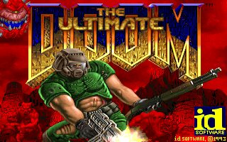
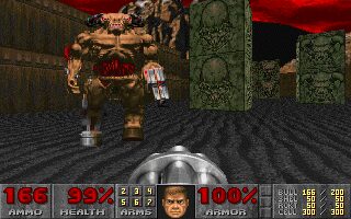
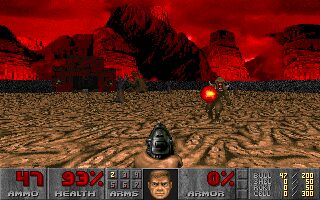
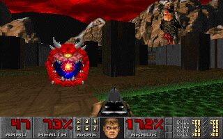
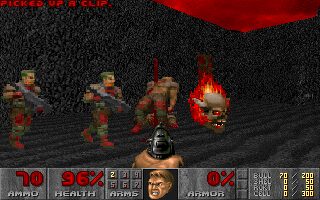
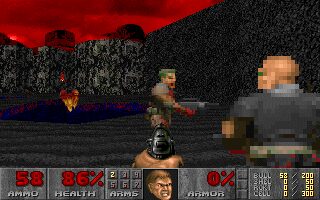
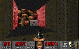
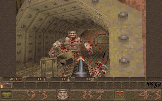
The Ultimate Doom is an updated version of the popular first-person shooter created by idSoftware. It was designed by Shawn Green, Sandy Petersen, and John Romero.
Ultimate Doom was released in 1995 and was meant to be the official retail version of the famous shooter, previously only released as shareware. This enhanced version of Doom includes an additional episode, made of nine levels (seven regular levels, one secret level, and one boss level). The name of the new episode is Thy Flesh Consumed.
Back in 1995 I did not know that there was an "ultimate" version of Doom and so I think I first saw some of the maps in 1996 on the Playstation version in (slightly) altered form.
From a perspective of "feelings" the fourth episode of Doom never seemed to really belong to the original. It appears as more of an upgrade where times had changed and the mappers of "old" wanted to show their refined skills in creating "better" content for an established classic. Next to that some maps where made with the, at that time, new Pentium processors in mind so levels like E4M2 must have brought 486 systems to it's knees.(Lucky those who had an Am5x86 running in their ageing rig.)
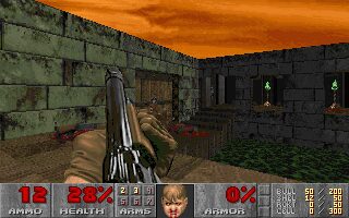
A good thing about the Episode is that it established a new style for itself despite using the well known stock textures. On the other hand this makes the episode appear a bit "departed" next to its "forebearers", as E2 and E3 had a more chaotic approach and the elusive E1 bore a sleek sci-fi-ish garment from start to finish. Thus logically "Thy Flesh Consumed" with its largely medi-evil "attire" did "the right thing" but somehow it feels thematically detached.
As for gameplay, the level of refinement is way higher than in Episode 2 & 3 clearly showing that the (in parts new) authors were pretty secure about their skills.
Maps like E4M2 and E4M6, both by Romero, are examples of great maps with a strong theme and a trend towards a steeper difficulty to appeal to seasoned Doomers.
McGee's entries, E4M1 & E4M4, are on the more minimalistic side with latter bearing too much of a methodical approach resulting in a level not able to fulfill its potential. E4M1 on the other hand is a really good, small, well designed and aesthetically pleasing player buster that can be played multiple times to test one's skills.(The NIN gag was most likely a cool thing back then.)
Green's E4M3/E4M8 shows that somebody took his mapping serious and E4M3 is one of the highlights of the Episode featuring sleek design(s) and interesting exploration/battles.
E4M5/E4M9 by Willits( & his sister) are solid takes on the Doom theme which are way closer to the original in looks than the other maps. E4M5 bears a strong E3 resemblance with visual hints of E1 sprinkled over it and the "secretive" E4M9 represents a proverbial, well made, late(r) era Doom level.
E4M7 by "Dr. Sleep" is a pretty good one, with dandy geometry, but like E4M4 it seemingly carries a bit of a user wad's fragrance... feels "just like another map by another Doomer".
Despite some harsh(er) words, Episode 4 is a must play for any Doom advocate but it suffered from being born too late and not really deserving an additon to the original as it does not feature a new boss, artwork or the "chaotic craziness" of later episodes. It would have been cool if the Punchatz duo had made an exclusive enemy for the final chapter of the original Doom but time restraints most likely did not allow for such a lofty "addon". On top of that I assume id did most likely not know which creation would fit into the existing monster roster as the last creative era back in 1994, during DoomII's creation, had already come and gone. And even back then they most likely could not come up with a design topping their own Spider Mastermind or Cyberdemon...
Overall - a neat set of great to good maps coming in a box with truly outstanding cover art.

